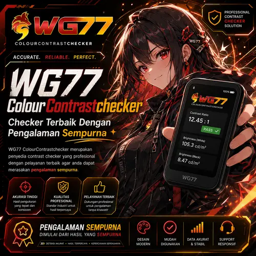
Why Color Contrast Matters
Ensuring accessibility for all users through proper color contrast
Visibility for All
1 in 12 men and 1 in 200 women have color vision deficiency. Proper contrast ensures content is visible to everyone.
Accessibility Compliance
Meet WCAG 2.1 guidelines and legal requirements like ADA and EAA by maintaining proper contrast ratios.
Mobile Readability
Good contrast improves readability in various lighting conditions, especially on mobile devices used outdoors.
Color Contrast Checker
Test your color combinations against WCAG accessibility standards
Text Preview
This is sample text
This is smaller text to check readability
Contrast Ratio
Normal Text
Large Text
Key Features
Tools to help you create accessible designs
Real-time Analysis
Get instant feedback as you adjust colors to find the perfect accessible combination.
WCAG Compliance
Check against Web Content Accessibility Guidelines (WCAG) 2.1 AA and AAA standards.
Visual Preview
See exactly how your text will look with the selected color combination.
Color Suggestions
Get recommendations for accessible alternatives when your colors don't meet standards.
WCAG Guidelines
Understanding accessibility standards for color contrast
WCAG 2.1 Level AA
- Normal Text: Contrast ratio of at least 4.5:1
- Large Text: Contrast ratio of at least 3:1
- UI Components: Visual information required to identify components should have a contrast ratio of at least 3:1
WCAG 2.1 Level AAA
- Normal Text: Contrast ratio of at least 7:1
- Large Text: Contrast ratio of at least 4.5:1
- Enhanced Contrast: Highest level of accessibility for users with severe visual impairments
Large text is defined as 18pt (24px) or 14pt (18.5px) bold and larger. All other text is considered normal text.
Ready to Create Accessible Designs?
Start using our color contrast checker today to ensure your designs are accessible to everyone.
Try the CheckerUnderstanding Color Contrast
A comprehensive guide to color contrast principles and standards
A Color Contrast Checker is an essential tool for evaluating the visual distinction between foreground elements (such as text, icons, or interactive components) and their background. By quantifying the luminance contrast ratio, it ensures that digital content is perceivable, accessible, and compliant with global accessibility standards.
Why Color Contrast Matters
Accessibility Compliance (WCAG & ADA)
The Web Content Accessibility Guidelines (WCAG 2.1) mandate minimum contrast ratios to accommodate users with visual impairments, including:
- Low vision
- Color blindness
- Age-related vision decline
Minimum WCAG Standards:
Level | Normal Text (≤18pt) | Large Text (≥18pt or bold ≥14pt) |
---|---|---|
AA | 4.5:1 | 3:1 |
AAA | 7:1 | 4.5:1 |
Failure to meet these ratios can result in legal risks (e.g., ADA lawsuits) and exclusion of users.
Enhanced Readability & Usability
Even for users without visual impairments, poor contrast leads to:
- Eye strain
- Reduced comprehension
- Higher bounce rates (users leaving a site due to poor readability)
Brand Consistency & Professionalism
A well-contrasted design reinforces brand credibility and ensures UI elements (buttons, alerts, CTAs) are immediately recognizable.
How a Color Contrast Checker Works
Luminance Calculation
The tool computes the relative brightness of foreground and background colors using the formula:
Contrast Ratio = (L1+0.05)/(L2+0.05)
(Where L1 and L2 are the luminance values of the lighter and darker colors, respectively.)
Ratio Interpretation
- < 3:1 → Fail (Unreadable for most users)
- 3:1 - 4.5:1 → Minimum (AA) for large text
- ≥ 4.5:1 → Pass (AA for normal text)
- ≥ 7:1 → High contrast (AAA recommended for critical content)
Dynamic Adjustments
Advanced checkers allow:
- Hex/RGB/HSL input
- Real-time adjustments (lightness/darkness tweaks)
- Simulated color blindness previews (e.g., deuteranopia, protanopia)
Best Practices for Optimal Contrast
- Test Early & Often – Validate contrast during wireframing, not just final design.
- Prioritize Critical Text – Headlines, buttons, and error messages need higher ratios.
- Avoid Pure Black/White – Subtle off-whites/dark grays reduce glare.
- Check Interactive States – Hover, focus, and disabled states must remain accessible.
- Use Automated Audits – Tools like axe DevTools or Lighthouse scan entire pages.